Color Psychology And How Colors Can Influence The Emotions And Meaning of a Piece
- nomnom jadee
- Oct 22, 2024
- 3 min read

Updated: Nov 19, 2024
How does the color blue make you feel? How about the color red? Many people say that the color blue elicits feelings of peace, trust and relaxation. Others say that the color red reminds them of anger, love and passion. These are examples of color psychology. Color psychology deals with the connection of colors to emotions and behavior.
Understanding color psychology could elevate your artwork to another, more connective level. The right colors have the ability to evoke specific emotions, sending messages to the audience.
How Colors influence Emotions and Story
Color is more than just a tool to add brightness or beauty to artwork. Throughout history artists have used color to tell stories, the first color palette consisting red, yellow, brown, black and white. The invention of new colors, led to the ability to tell more complex and dynamic stories through art. Colors play an essential role in shaping how we experience and interpret art.
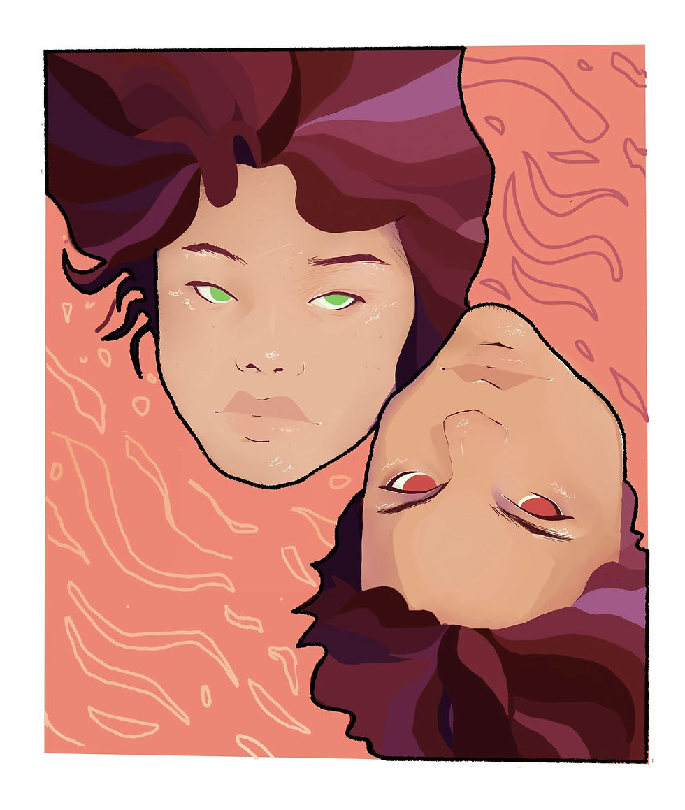
Red is associated with Passion, love, energy and anger
Blue is calm, trust and sadness
Green symbolizes growth, harmony and envy
Yellow is Joyful, hopeful and also cautious
Black indicates power, mystery and grief
White is pure, simple and peaceful
An example of color being used to convey an emotion is in “The tragedy” by Pablo Picasso. Picasso used a monochromatic color palette of blue to express the sad and somber mood he was in. The colors in the painting immediately connect with the audience, making them feel a little bit of the sadness Picasso was feeling when he created the piece.

“Colors, like features, follow the changes of the emotions. ”
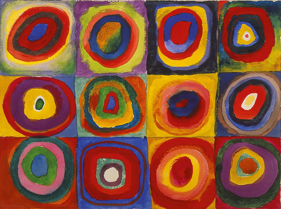
Color theory can also be used to create a mood. analogous colors such as red, orange and yellow can be used together to create feelings of excitement and intensity in a piece of art. While, cooler colors such as blue, green and purple can bring about a sense of calmness or melancholy. The commanding, bright nature of warmer colors is what makes them feel so exciting. Hazy, soft colors like blue and green are reminiscent of peaceful moments like the night or a field of grass. Sometimes those colors can remind someone of a moment long gone, something they could never get back but long to relive.
How to Use Color in Art
To properly use color theory in art, you have to understand your audience. In some cultures, certain colors have different meanings compared to western meanings. In many Asian cultures white is often associated with death or mourning, while white is often a color attached to positive meanings in the west. It is important to understand who you are speaking to when you are using art as a communication tool, so you know what “language” to speak in.
“Great art speaks a language which every intelligent person can understand. The people who call themselves modernists today speak a different language.”

After you know who your audience is, then you should decide what kind of mood you want to portray. Knowing what kind of mood you want the piece to give off, will help you decide what color palette to use. Understanding color theory will also help you improve your artistic skills and language greatly.
In Conclusion,
Color can greatly elevate an artist’s work. And understanding the psychology behind colors can evoke different emotions, tell stories and connect with the audience.


Comments